Labels: dsdn101
Ludmila Dymnikova's stop motion clip
For the beginning for Ludmila's stop motion video, she has decided to hand paint each letter in the introduction. I feel like this approach will really attract the attention of the audience. The colour palette chosen is bright and thus gives a friendly and fun aesthetic to an animation that would be touching upon a serious subject. Painting on-screen is also quite a challenging method to use as any mistake will mean that she would have to start all over again since the paint cannot be erase. Thus I feel that she has done a great job in this area. There is a smooth transition between each frame allowing the animation progress smoothly.
One thing to perhaps work on is to try and minimise the movement of the camera as the clip feels a little shaky. This can be achieved easily by using a tripod and hence is not a huge problem. She could also try to make sure that the words on screen is centralise as it is currently located a little too far to the right.
On the whole, I feel that Ludmila has chosen a very interesting approach to her stop-motion clip and it is something that I have not seen anyone else doing. I look forward to see how her final animation would be like.
Labels: dsdn101
Labels: dsdn101


Labels: dsdn101


Getting to get the general idea about the contents in my animation. There is quite a bit of content in it, especially since for most part of the animation I would be splitting the screen into two halves, kind of like having two videos playing side by side at the same time. Perhaps I would need to cut down on some parts when it comes to really drawing and putting together all the scenes.
Labels: dsdn101

My plans for what I wanted in my animation. However, I decided to change the challenge I would focus on from the Mighty Ks to the slum challenge. This is because I would be drawing every frame, and it was really hard to have the character cycle, run etc. smoothly and convincingly.
Labels: dsdn101
However, I do like how it turned out. I like how it looks sketched out in real time, and how even though there might not be any specific motions in the video, the different drawings still moves a little. I think the overall aesthetics would really appeal to the target audience. It also relates to the style of my logo.
Labels: dsdn101
Labels: dsdn101, inspiration
10 fps
20fps
Labels: dsdn101
For this project, I have decided on creating a stop motion animation to promote the Caritas Challenge. Since the video meant to be watched by a younger audience and to interest them to participate in the challenge, I feel that stop motion animation would help me achieve that because it is a fun way to display information and pictures.
I would be focusing on the Mighty Ks challenge which requires participants walk, run, swim, cycle or play a sport for 24 hours to highlight the plight of those people all over the world who have to travel often long distances just to access basic necessities such as food, water, health and education. I chose this because it seems like the one challenge that children could still have fun participating with their friends while putting themselves in the shoes of those less fortunate. For the animation I would be using a combination of different methods of stop motion animation I found out about through my research, more specifically using paper cut-outs and also hand drawing. Paper mostly for the pictures and hand drawing for the words and information I want to be present in the video. Because the information would already be present in the animation, I would be able to insert a background soundtrack. I think a light and bouncy tune would appeal the younger audience greater and at the same time project a more fun and lighthearted feeling to a challenge that may otherwise seem physically tiring and deter the audience from participating.
Labels: dsdn101


Group members:
Sui Ying Hon
Taylor Bryant
Richard Sutton
Labels: dsdn101

Labels: dsdn101
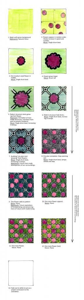
This was the part of the project I had the most trouble with, spending a lot of time doing the simplest motions because I have never touch flash before. Since I knew that I would not be able to do fanciful and impressive animations compared to those who had more experience, I wanted to use a strong narrative in the animation as a means to bring in more interest.
The animation is divided into 3 sections: the past, present and future. In the beginning, white background behind randomly placed flowers was used to represent cleanliness and nature. As time progress, more straight angular structure was incorporated, representing industrialization and modernization in our surroundings. During this time, the background also changes from white to grey, reflected the lost of natural surroundings as a sacrifice for advancement. In the third part, piano music is incorporated to suggest hopefulness for the future in which, as seen in the video, we can come to include nature more in our lifes, whilst developing and also cleaning up our surroundings, represented by the background colour transition from grey back to white once again.
Labels: dsdn101
Labels: dsdn101

Labels: dsdn101


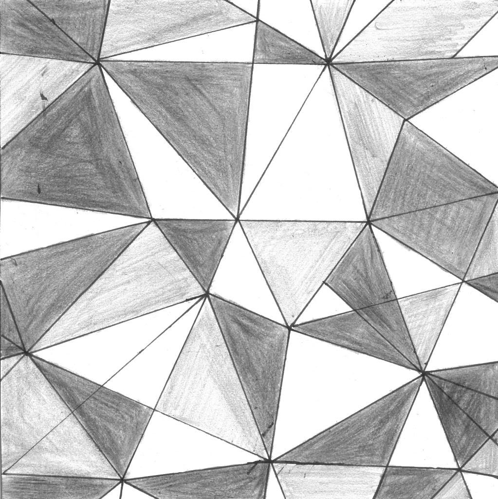


For my window drawings, I focused mainly on geometrical patterns which I am particularly partial to. I enjoy the dynamic visual it gives the viewer. Geometrical shapes and patterns are also present in the many Chinese art and I was mindful to incorporate that into my pattern.
Labels: dsdn101

The backbone of the structure is a geometric pattern which I explored in my research and also most of my window drawings. I added flowers, as almost any and every flower has symbolic meaning to the chinese. In the square spaces I wanted to incorporate modern elements that relate to my surroundings and Singapore today. Therefore, I added in a pattern which is representative of a city layout, a top view of a very packed city. This is something that reminds me very much of Singapore, with her ever increasing number of high-rise buildings as its economy and population grows
Labels: dsdn101
In finding directions for the development of my pattern from my cultural background, it is interesting to highlight that I am a Singaporean chinese. While I would still explore typical chinese motifs and art, being Singaporean, I would say that my culture is more complex and hybridized than that. I will thus be mindful to try and incorporate the diverse fusion of culture that I was brought up around, while building on the chinese culture. To illustrate this, I will be looking in finding particular objects or influences that is common to both Singapore and the Chinese culture. In the beginning stages of research, something common to both that I have found are flowers (more specifically the orchid) and also the lion. Other than my cultural background, I will also be incorporating my personal style into the final pattern developed. Personally, I have a minimalistic approach to my design and hence hope to portray this in my pattern. This could be in the form of a pure colour palette and/ or really abstracting the initial pattern through iterations to strip it down to its bare essential lines.
Labels: dsdn101
Animated initials: trying out flash for the first time.
Labels: dsdn101


Brainstorming of some initial ideas and symbols to use in my pattern. For my chinese culture, I wanted to concentrate on the idea of geometry because it also related to my personal style with its clean lines and shape. For my Singaporean identity, I looked into objects that had significance to my country. I looked at the Merlion which is a famous tourist attraction and also had a very interesting and quirky quality to it (half lion and half fish). I also looked at the orchid which is Singapore's national flower. It also ties to my chinese heritage, as flowers have long had a great presence in the culture and art. In the chinese culture, Orchids represents wealth and fortune. The ancient Chinese philosopher Confucius also added to the positive symbolism attached to the orchid, writing of it as a "flower of noble characte."
Labels: dsdn101
0 comments / + add comment